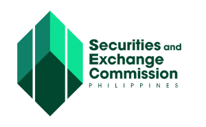
| In graphics design, this logo is classified as combination mark in that it fuses an icon and some text (or wordmark) into a visual beacon. At first glance, it appears to be a cube suspended in mid-air but the two white, parallel lines running across it vertically as though overlaid give it a distinct Escher-esque aesthetic to the entire design – which is meant to stress the uniqueness of the SEC as a public sector institution in our country. |
| When seen from a distance, however, this logo is actually an elongated hexagon – the six sides of which represent the core values of the SEC, viz: integrity, professionalism, accountability, independence, initiative, and teamwork. Its shape imbues it with timeless integrity and allows it to exude elegant simplicity. |
| When seen up close, on the other hand, this logo features silhouettes of three rising buildings representing the corporations (left), the SEC (middle), and the investors (right) all of which are sitting atop a perfectly chiseled diamond serving as the bedrock of stability, reliability, and strength; and whose four sides correspond to the people that make up the agency working together towards the achievement of its mission and its vision, viz: the leadership, the management, the technical specialists, and the support staff; the image of these buildings connotes the national economic development goal to which the agency is mandated to contribute by way of its three critical roles, viz: corporate registrar, corporate regulator, and champion of investor protection. |
| That green is the color of choice for this logo is meant to convey associations with life, growth, prosperity, and the use of three varying shades thereof that blend well together is a way of paying homage to the Philippine flag whose three major colors converge on a common vertex. |
| Principal Elements of the Logo |
| • |
Hexagon – The shape depicts the SEC’s core values. It also suggests balance, cohesion and communication. |
| • |
Three Rising Buildings – The bars represent the corporations, the SEC, and the investors. The image of these buildings connotes the SEC’s contribution to national economic development through its three critical roles, viz: corporate registrar, corporate regulator, and champion of investor protection. |
| • |
Diamond – Each side of the diamond corresponds to the people who make up the agency working together towards the achievement of its mission and its vision, viz: the leadership, the management, the technical specialists, and the support staff. |
| Subliminal Elements of the Logo |
| • |
Shield – The logo is reminiscent of a shield symbolizing the protection that the SEC provides to investors. |
| • |
Gold Bars – The two bars on both sides are shaped as gold bars denoting wealth and prosperity, which are important facets of the market it encompasses. |
| • |
Philippine Flag – The three shades of the logo take their cue from the color pattern of the Philippine flag – to pay homage to the Republic that the agency serves. |
| Color |
| The SEC’s official color is green, which signifies life, growth and harmony. It also denotes money and finances. |
| Registration in the National Historical Commission of the Philippines |
| The logo is duly registered in the National Historical Commission of the Philippines signed in April 2016 by its Chair, Hon. Maria Serena I. Diokno, and by the Deputy Executive Secretary of the Office of the President, Hon. Michael P. Ong. |